Baseline Study Brand and Assets
The Baseline Study is a 5-year clinical research collaboration between Duke University, Stanford University, and Verily. The study tracks 10,000 participants to establish the baseline for human health. As a designer on Verily's UX team, I embarked on six-weeks of short design sprints to develop a visual identity for the project. This included the brand mark, colour palette, typographic standards, illustration and photographic style.
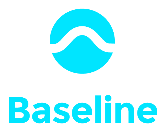
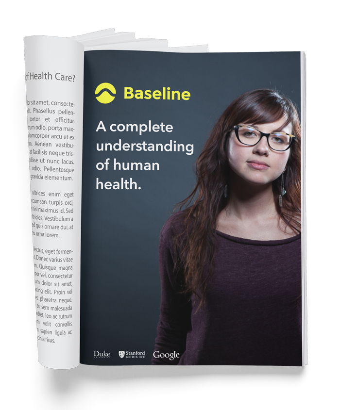
The brand mark is actually a bell curve enclosed in a circle. It represents a statistical whole; encompassing all races, ages, genders, and lifestyles. The mark succinctly conveys the core mission of the study; to be universally inclusive, so as to discover the common threads of health and disease.
The bell curve

Colour palette
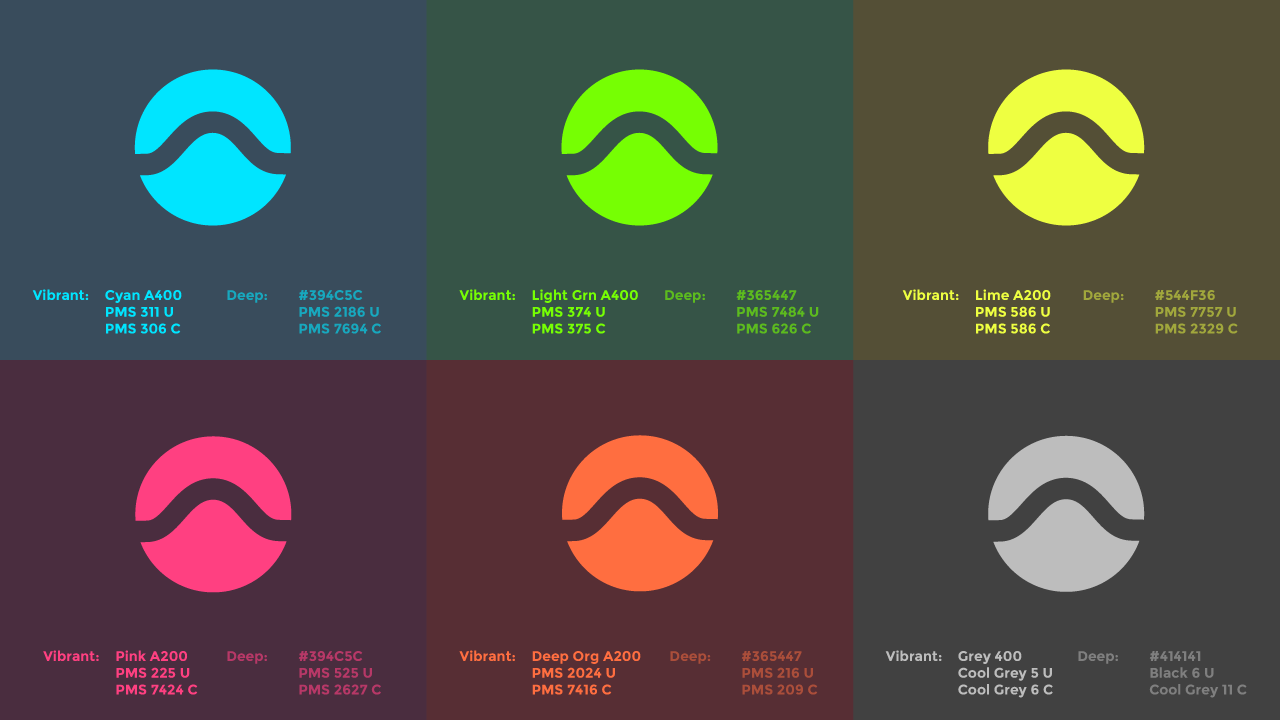
The Baseline colour palette consists of 6 deep hues paired with 6 vibrant accent colours. The accent colours were chosen from the Google Material Design palette.
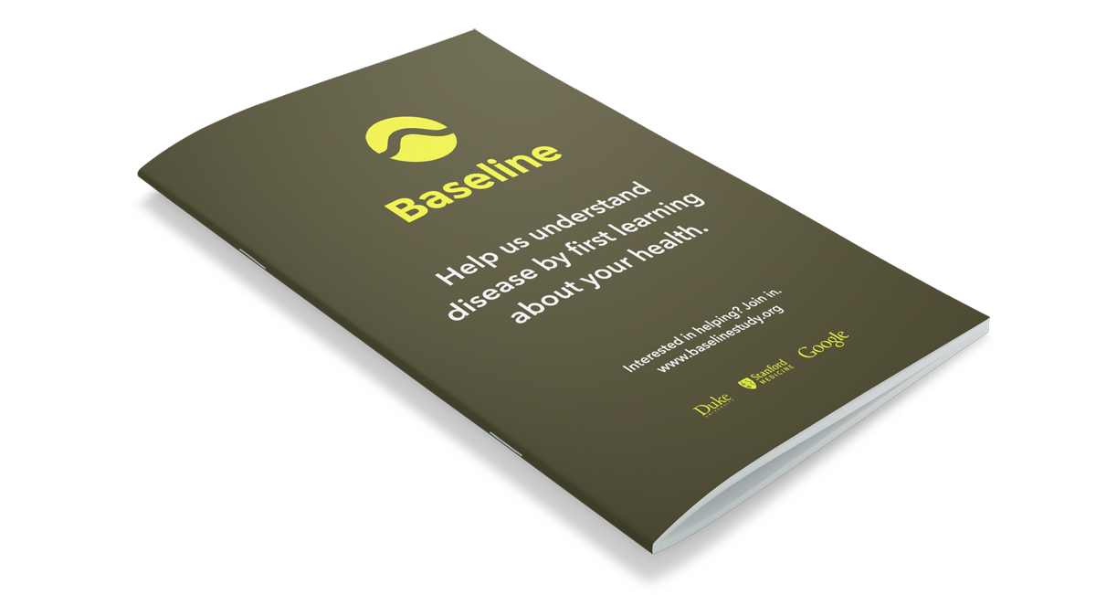
Materials

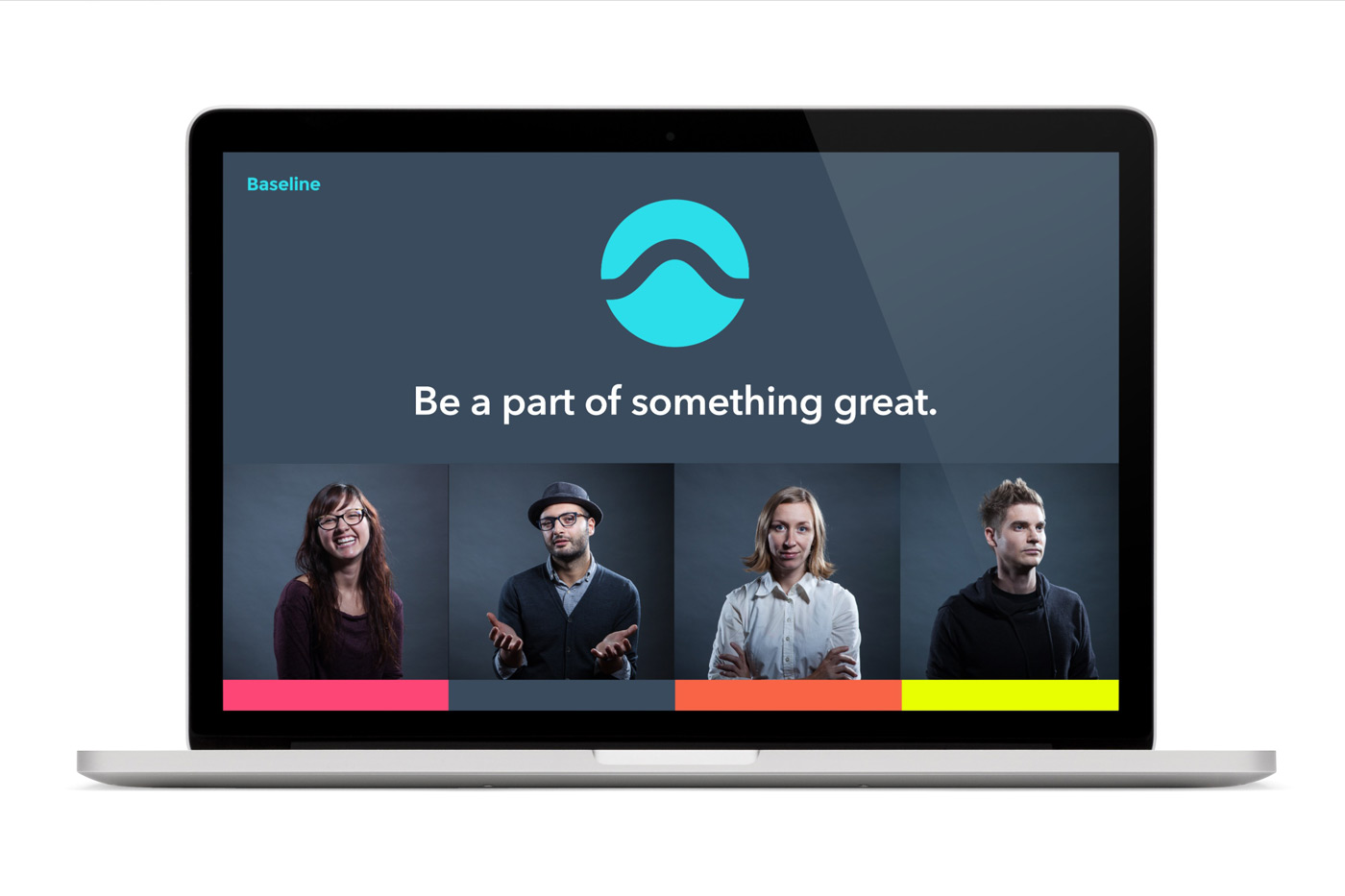
Marketing Website
After the brand language was established, I worked with writer and project managers to design the Baseline Study marketing website.