Liftware Website
For several years, Liftware was known for a single product: the Liftware Spoon, designed to help those with essential tremors eat more easily.
But when the team designed a second product—aimed at solving the same problem, but for users with a very different set of needs—suddenly, both product branding and positioning needed to be completely rethought.
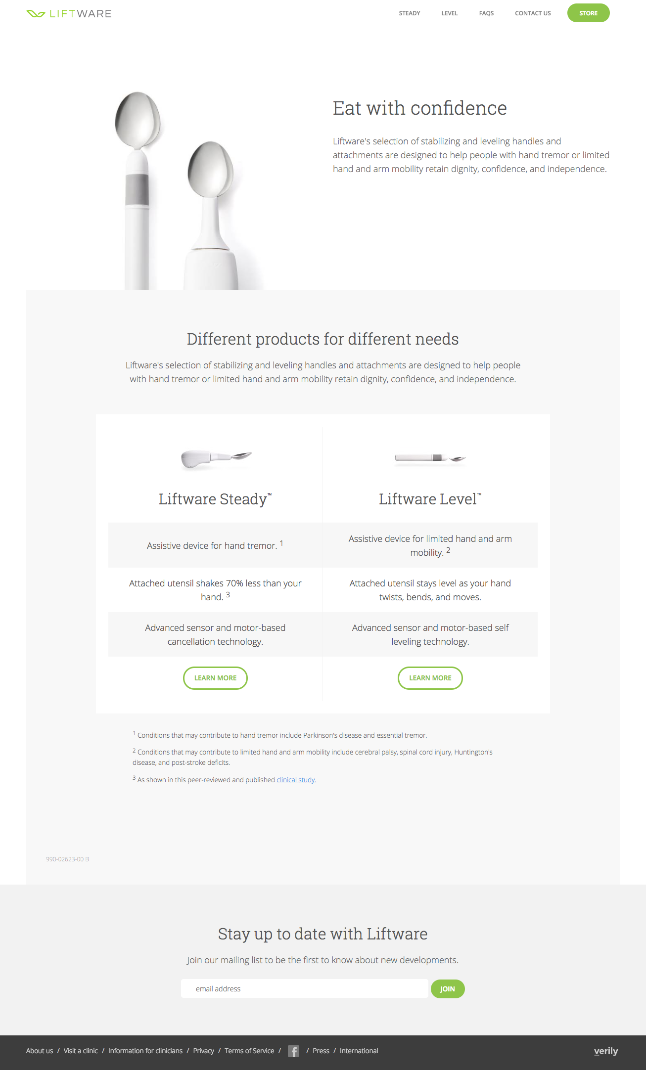
The first step was to help users quickly guage which product was right for their needs. To help with this, we choose descriptive names for the products, 'Steady' and 'Level'. Liftware 'Steady' helps counteract the effects of tremors, while Liftware 'Level' keeps the spoon head horizontal for those with limited arm and hand mobility.
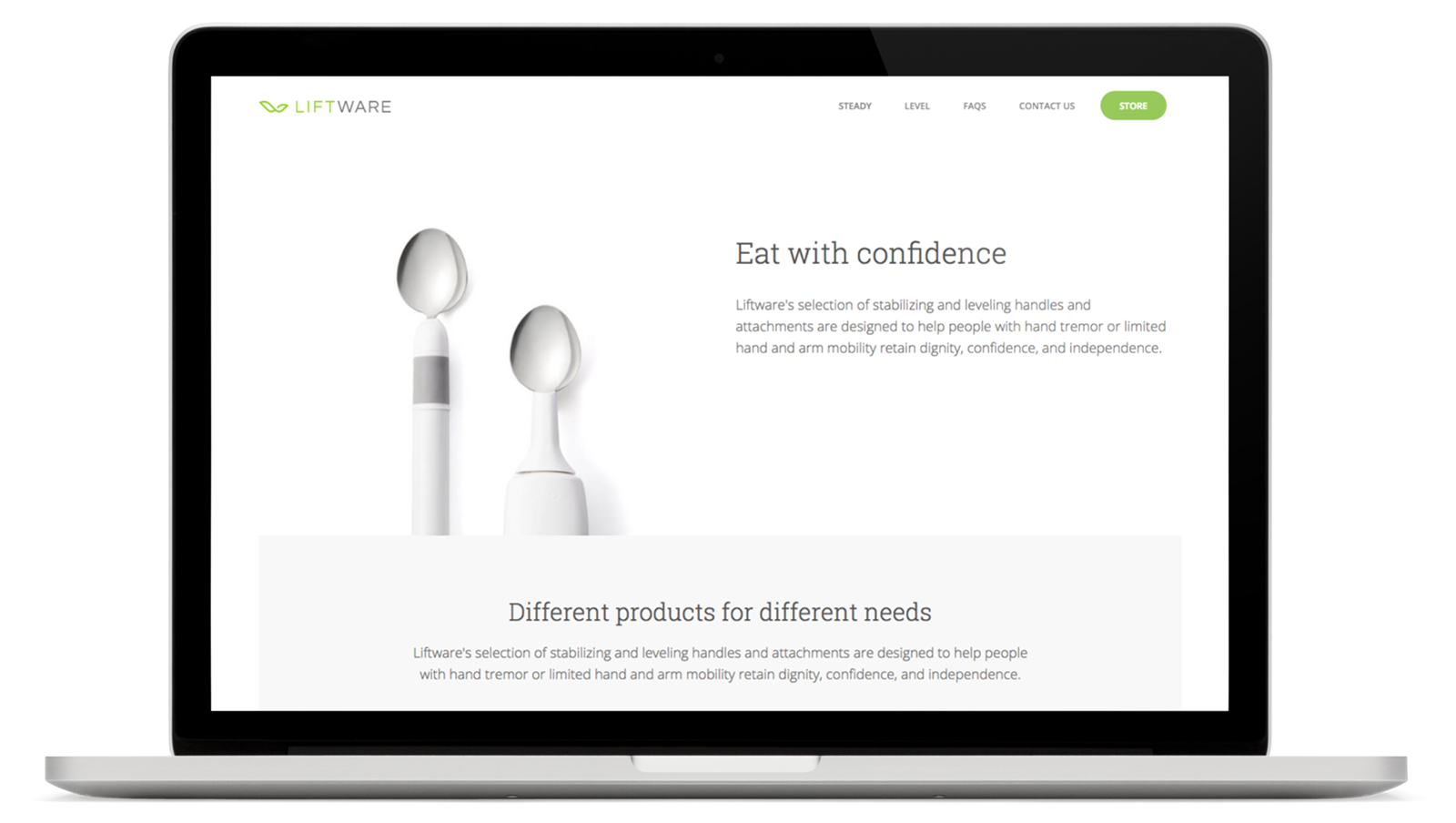
The home page of the site focuses solely on solidifying this distinction and guiding customers towards the appropriate product for their needs.
Home page
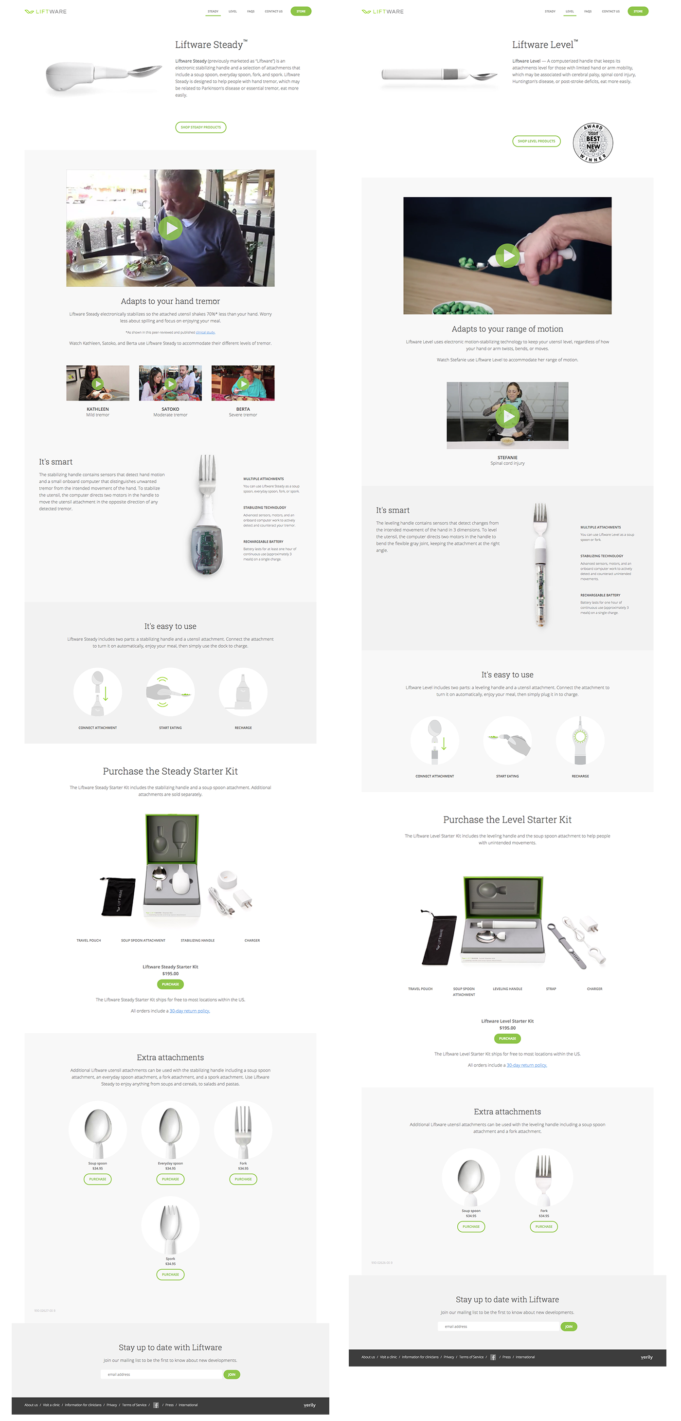
The two product pages were designed to be identical in structure: Hero image and product description; followed by a short, looping demo video of the product; followed by product features, and then a purchase section.
Product pages
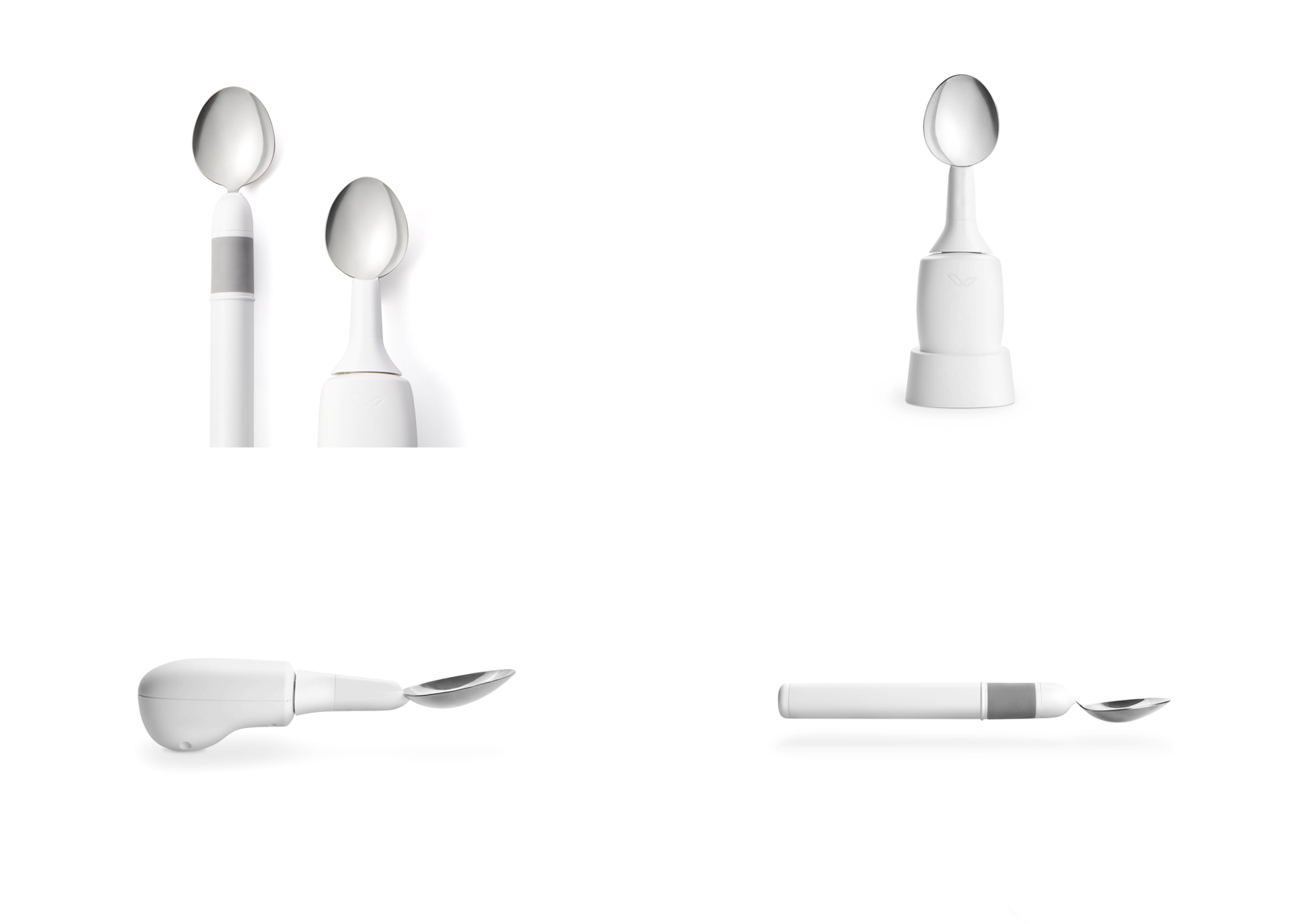
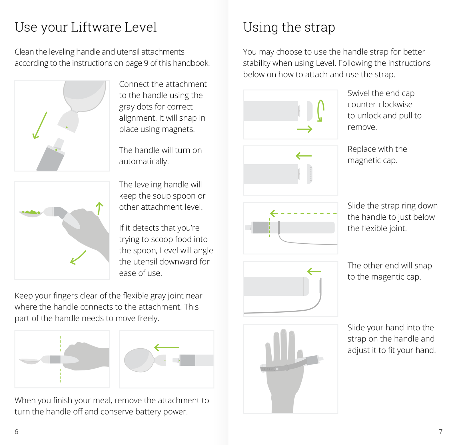
As well as the UX and visual design of the website, I also shot and edited the product photography, designed the product packaging, and designed and illustrated the user-manuals.
Product photography
User manual
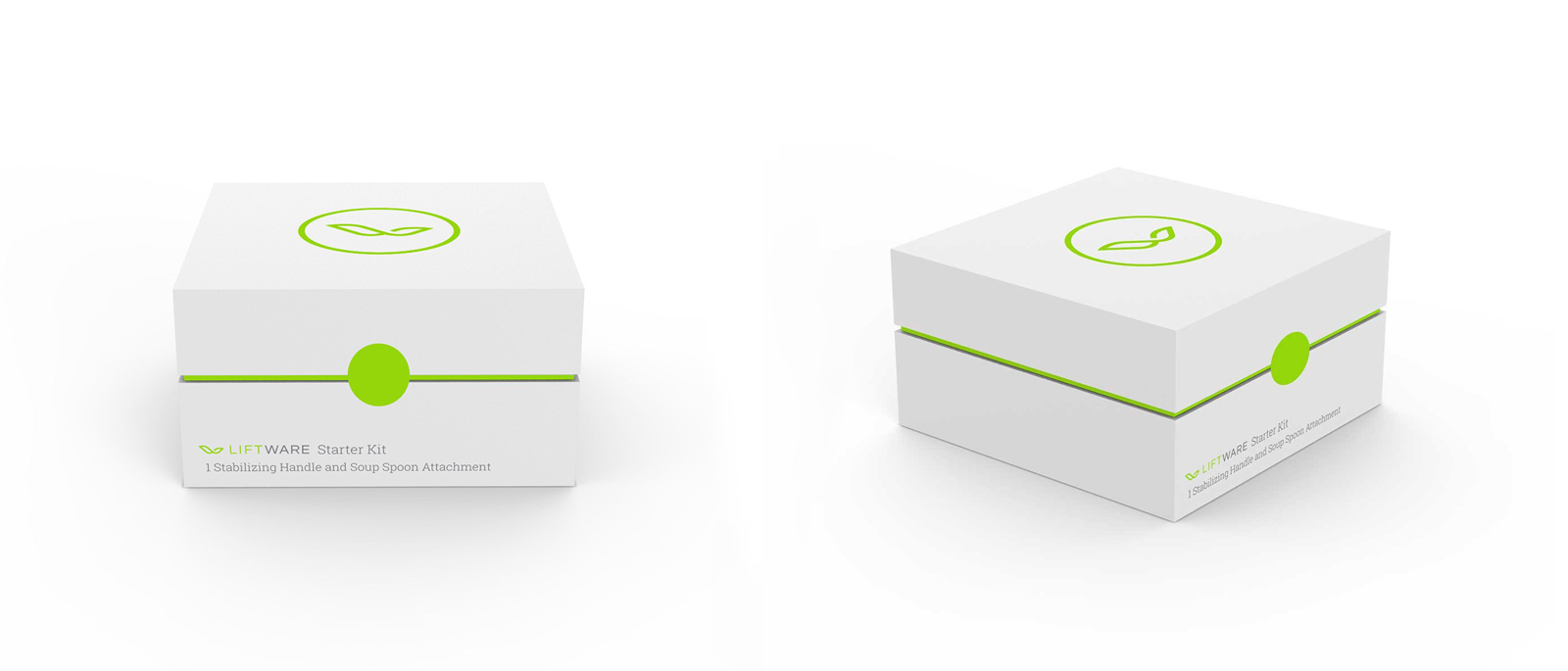
Packaging