Oops! Correction Tape Brand & Packaging
This was a really fun project; the challenge was balancing a playful name like Oops!, while keeping the design package in-line with other Staples® brand products.
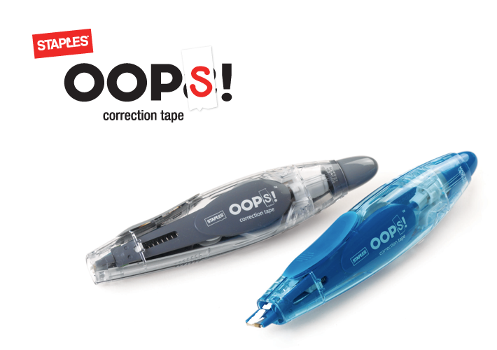
The logo consists of bold, custom-drawn lettering with a simple correction strip and handwritten S. (The corrected mark is a backwards letter S.)
Dual-Language Logo Variations
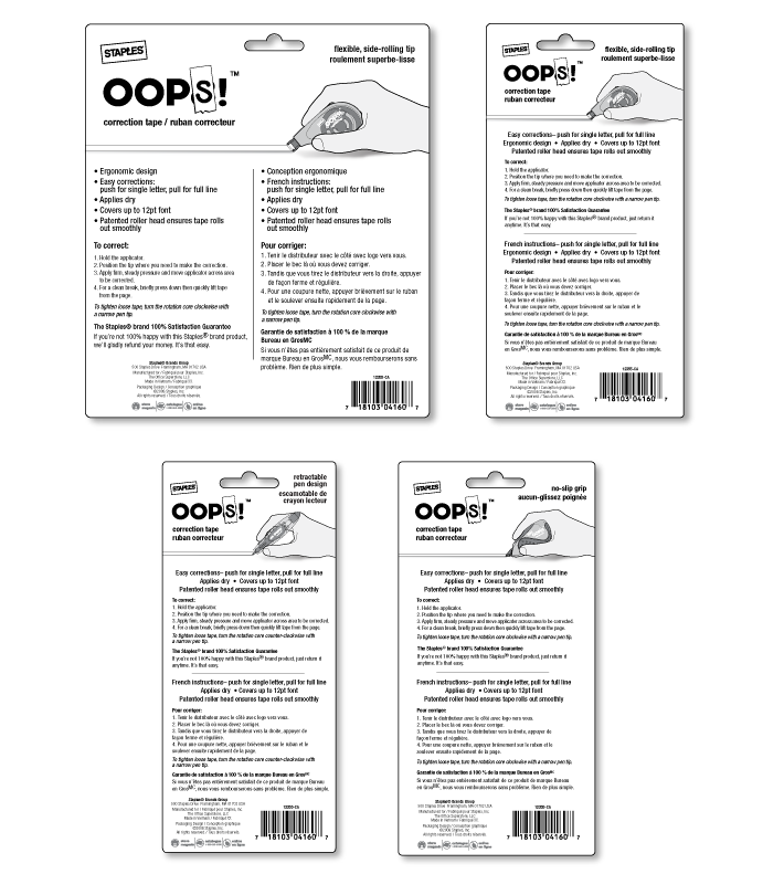
Packaging Front
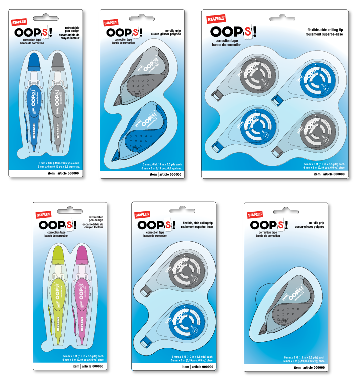
Packaging Back