PayPal Design Redux
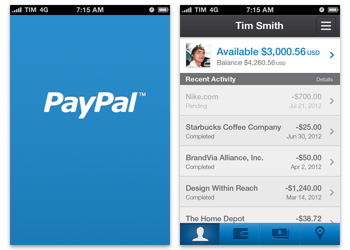
Working on the redesign of PayPal’s mobile app, I really wanted to move the aesthetics away from the [then] skeuomorphic nature of iOS6, in an effort to reunite the app with its greater brand style. So, advocating for brand standards instead of subservience to platform trends, I took the initiative to redesign the app screens in a simpler, more universal “PayPal” manner.

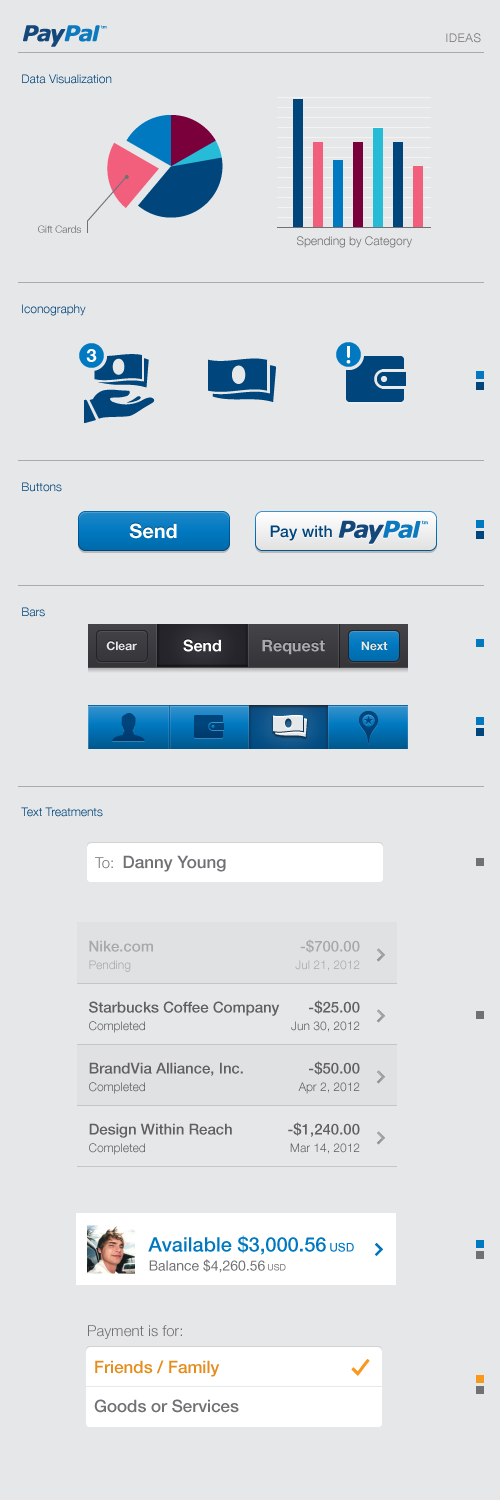
For the in-app screens, I immediately removed most of the ornamentation such as stitching, leather and linen textures (which, since Paypal don’t deal with physical wallets, had no meaning and served only to cheapen the overall experience). This also freed up a surprising amount of pixel space for some much-needed breathing room.
The entire new layout is designed on an 8x8px grid (@2X size) which helps ensure UI elements, images and typography can be sized and spaced consistently.
Splash Screen and Balance Details
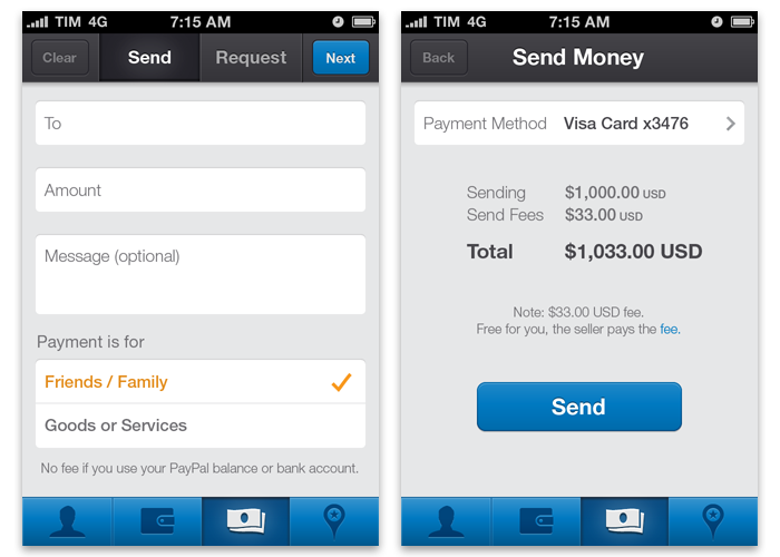
Send & Request Money, in the same place
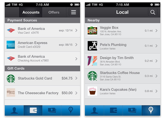
Account Settings and Local
In this redesign, I proposed something that customers could finally recognize as a PayPal product, a brand they know and trust. The use of simple blue, grey and white elements may be predictable but what was most important to this redesign was to create a visual system that was simple and scalable across platforms; requiring very minimal changes to adapt for Android and Windows Phone.
Basic Design Elements
Sadly, this redux wasn’t deemed the right direction at the time of its presentation. However, with the upcoming introduction of the new iOS7 design style, I suspect some of these ideas may find their way back onto the table in the near future…
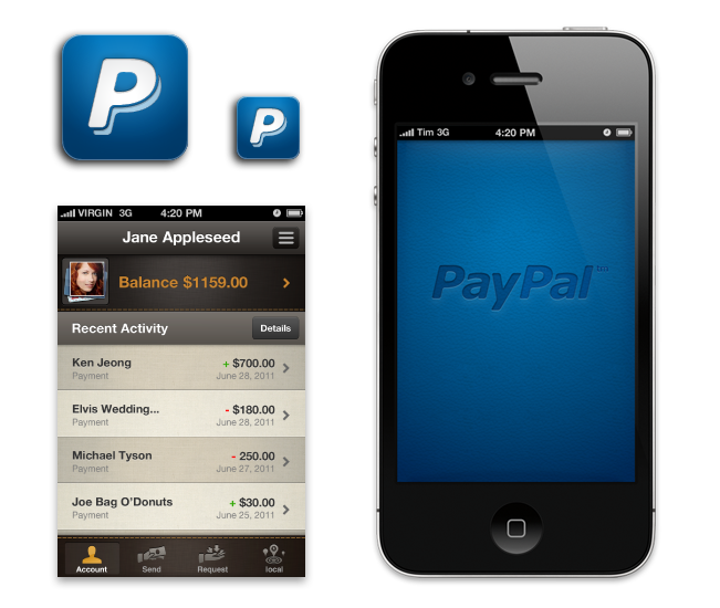
Existing PayPal App Style