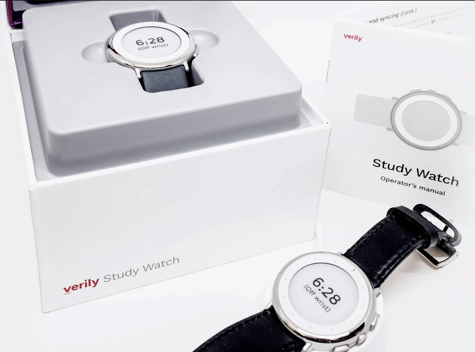
Verily Study Watch
Study Watch is a sensor-based wearable device for non-invasive, continuous monitoring, featuring clinical quality ECG measurement and a host of sensors to evaluate environmental data in tandem with biological signals.
Study Watch is a sensor-based wearable device for non-invasive, continuous monitoring, featuring clinical quality ECG measurement and a host of sensors to evaluate environmental data in tandem with biological signals.
Designed for use in clinical studies with a variety of goals, it’s a versatile tool in the Verily Study Kit system of technologies. The primary UX challenge for this product was minimizing on-device content and actions for a broad demographic of patient types.
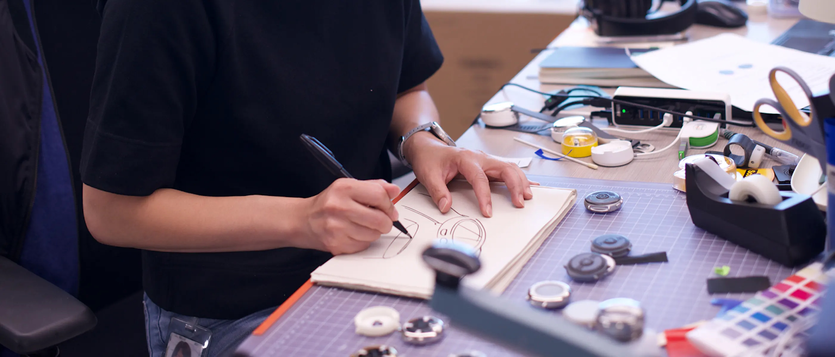
Working on this project from the very start, I collaborated with Industrial Designers and Electrical Engineers to determine the specs for the display, and the number, position and functionality of the physical buttons on Study Watch.
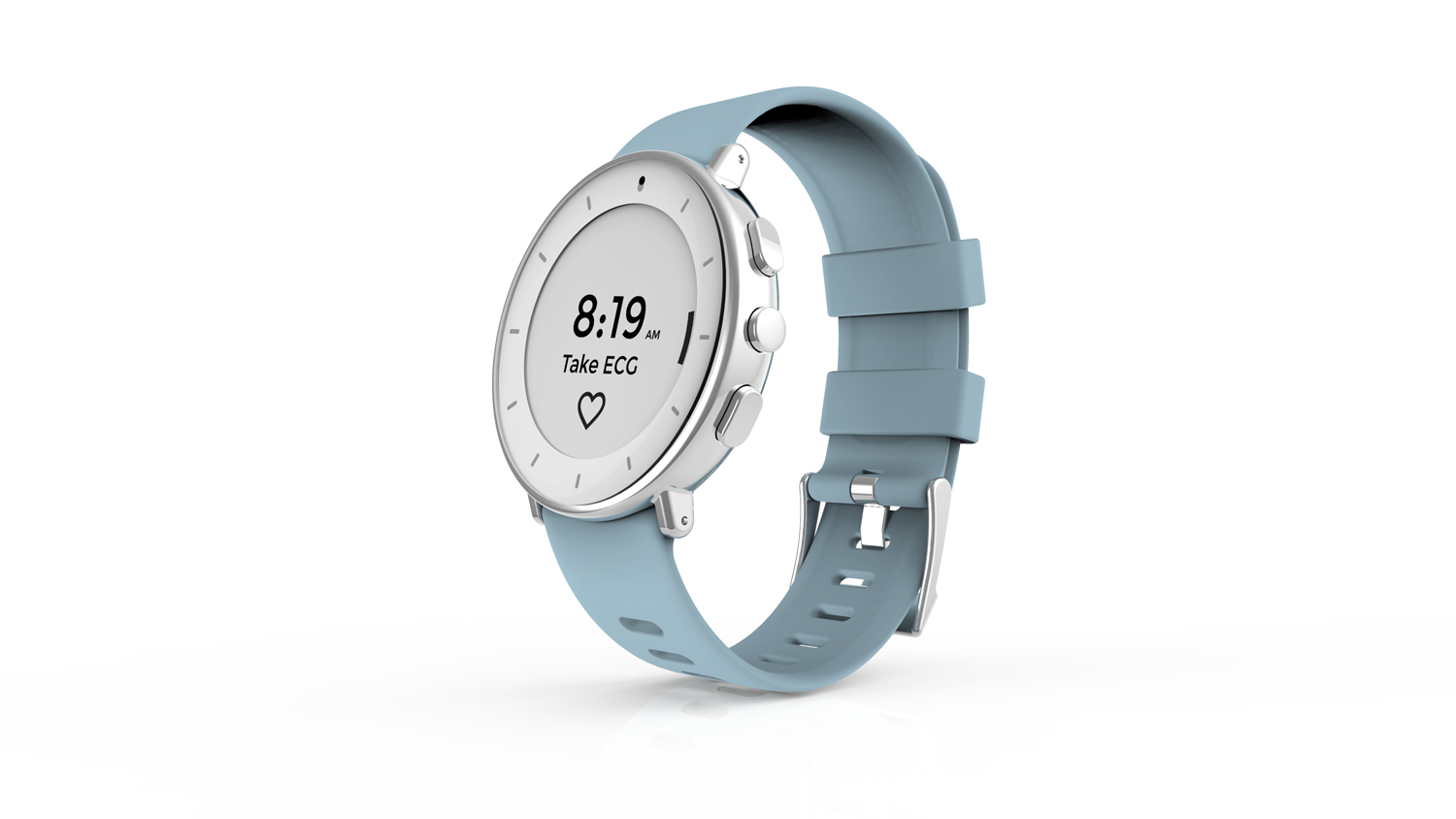
We landed early on an e-ink display to cut costs and extend battery life, since visual richness was not a primary goal for the experience.
For input controls, I opted for physical buttons over touch screen because it proved more accessible and usable to a broader set of patient demographics.
Study Watch launched with a basic set of core features for patients to use during studies, but the framework needed to be designed to scale easily for future updates and features.
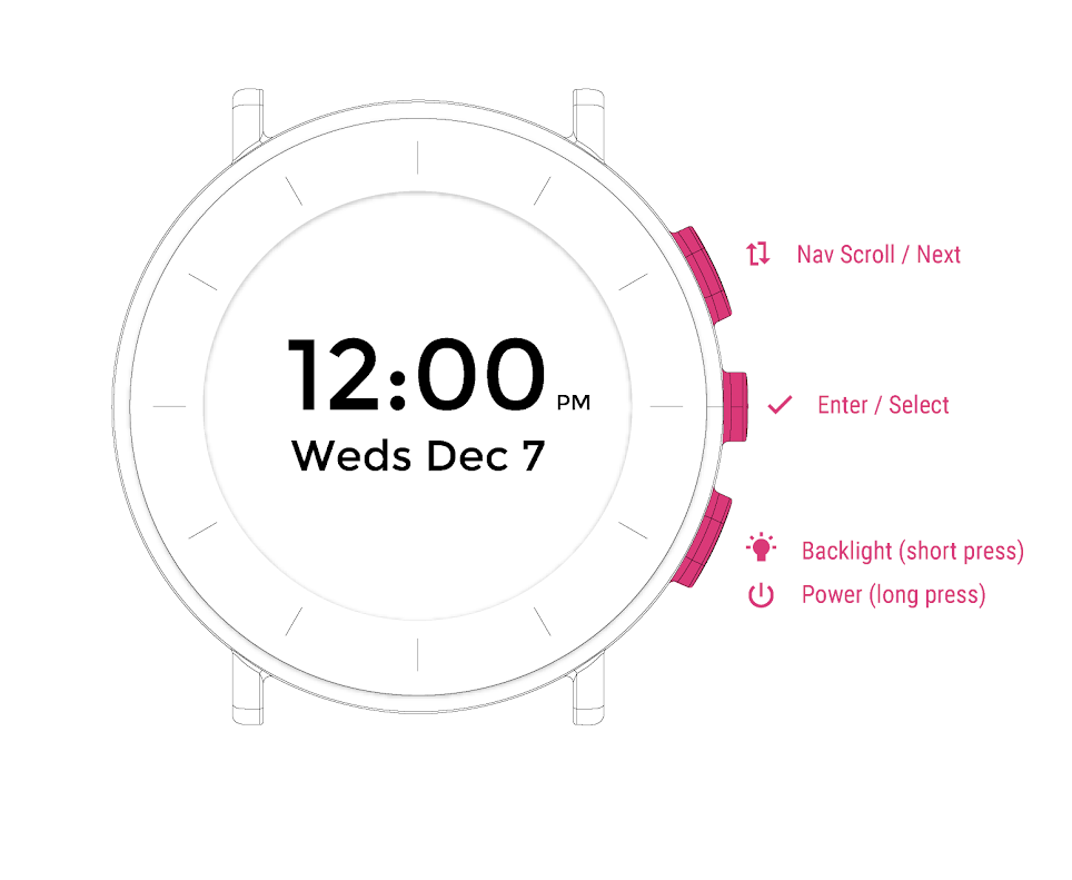
After testing out several activity watches and connected devices with physical buttons, I decided on a 3-button configuration, which allowed for navigating lists, selection and canceling actions.
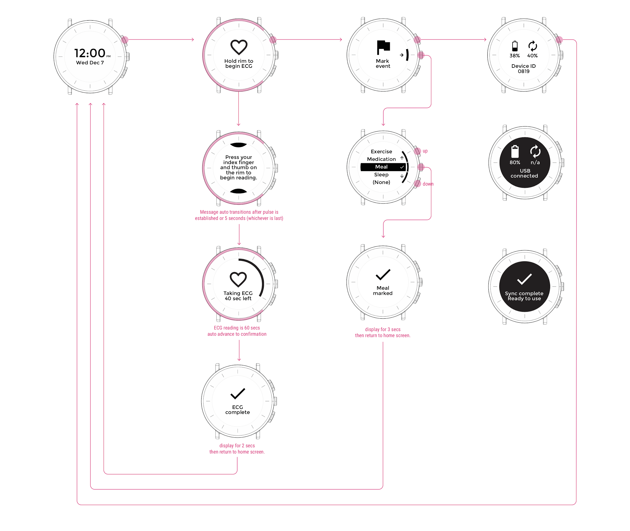
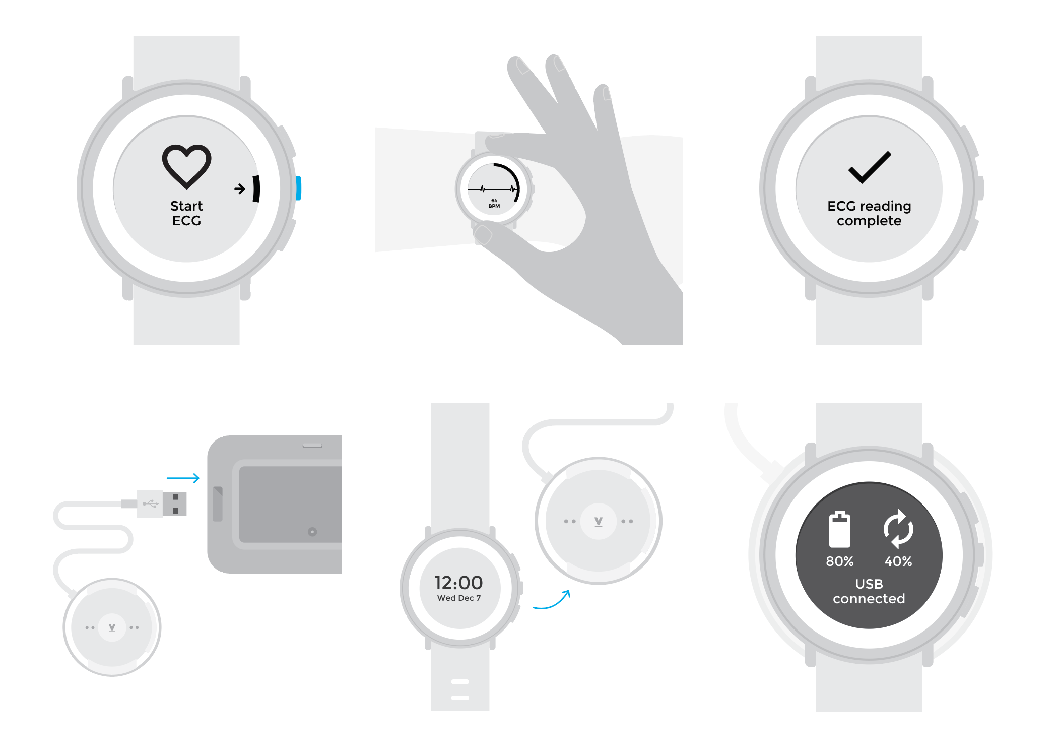
Using a new device with several buttons and actions can be a daunting task for patients, especially for those who are less tech-savvy. To help with this, I created a black ring that highlights the buttons available for each feature. These are accompanied by icons when multiple actions are available.
This black ring also serves as a countdown progress ring during ECG and heart rate readings.
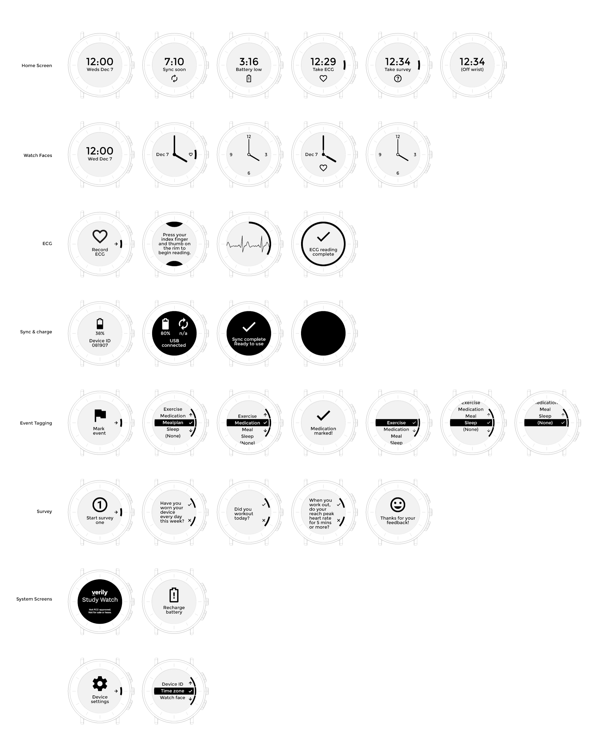
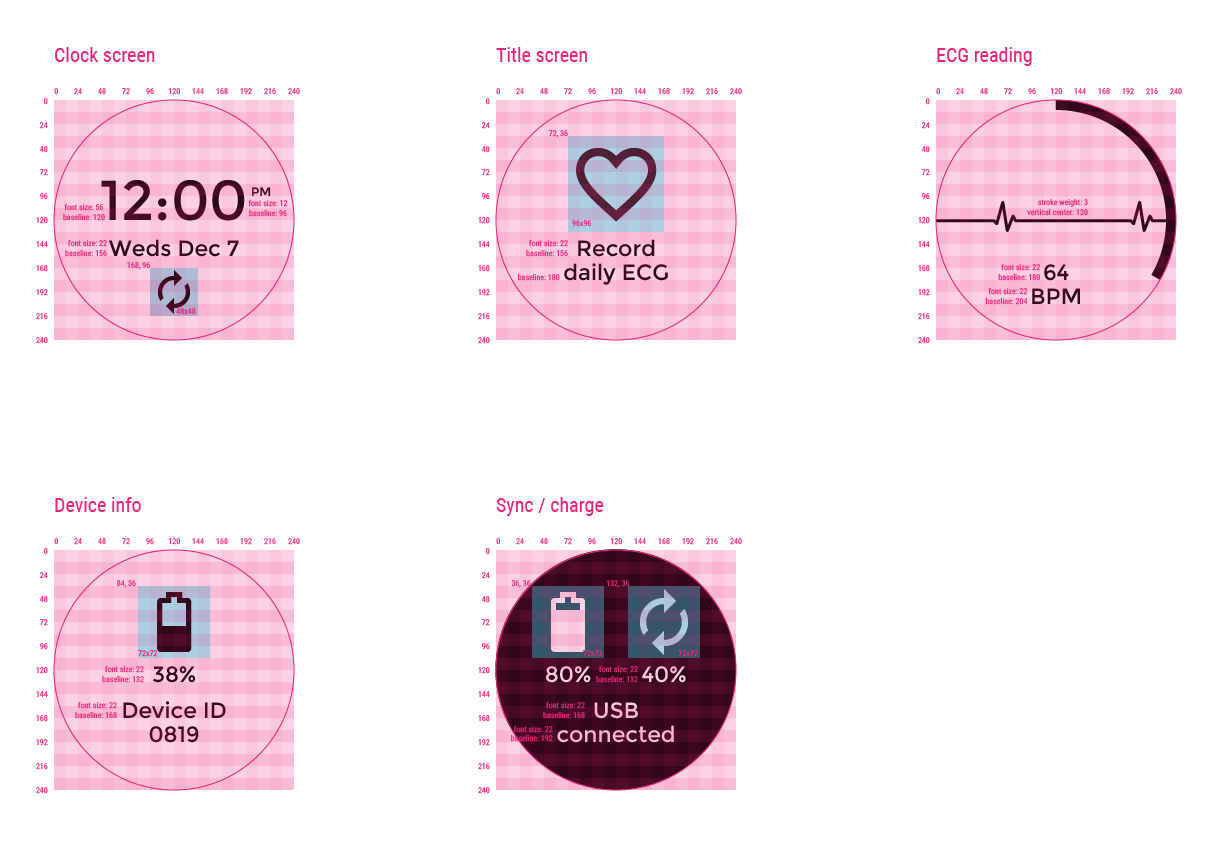
The e-ink screen I selected for the watch is a 240 x240px resolution, which worked well with Google’s existing 24dp icon sets.
I worked directly with software engineers to optimize a custom anti aliasing curve on the 2-bit display (white, black and 2 shades of grey), resulting in a more natural, crisp presentation of information.
To help meet product launch requirements, I collaborated with ID and packaging partners to design the product packaging and user guide, complete with custom illustrations for step-by-step instructions.