Tri NE Club identity
The Triathlon Club of New England was established in 2010 for the growing population of multi-sport athletes in Rhode Island and Southeastern Massachusetts. It serves to create a community of teamwork, support and training for beginner to intermediate triathletes.
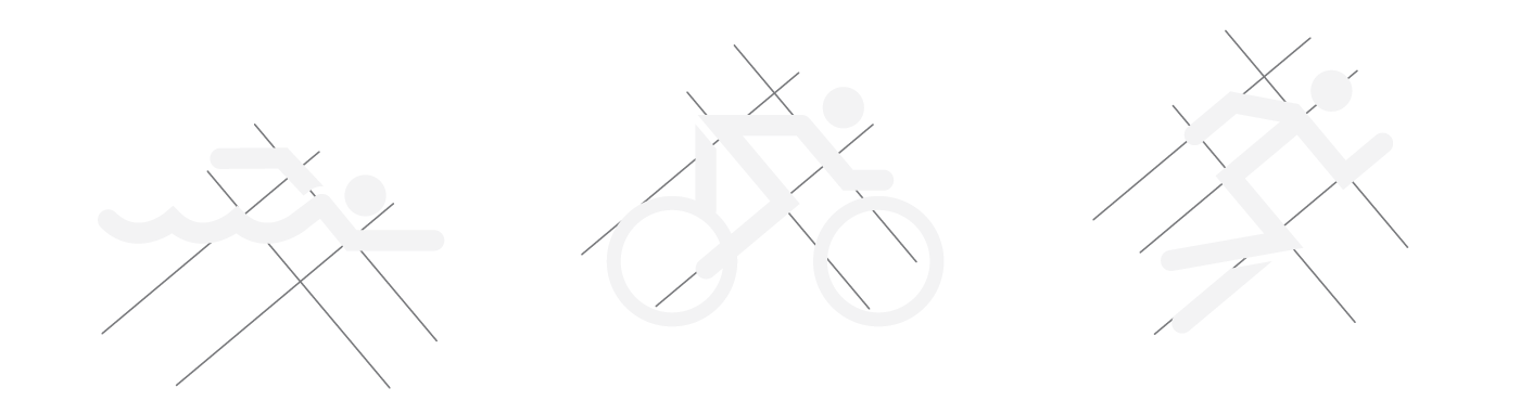
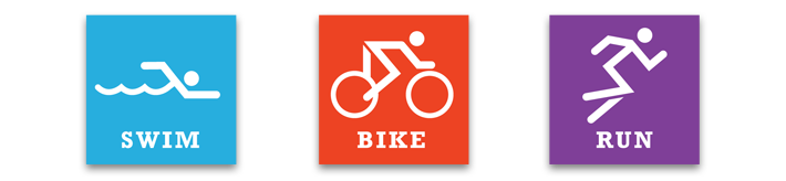
Icons for the three events— swim, cycle, run— were designed individually, using 40° and 50° guidelines (for a slightly forward lean), and then brought together for the final logo mark. The icons give a generous nod to past olympic event pictograms while maintaining their individuality and playfulness.
Colour variants
This was a quick turnaround logo project with the goal of being simple and clear for a variety of applications.
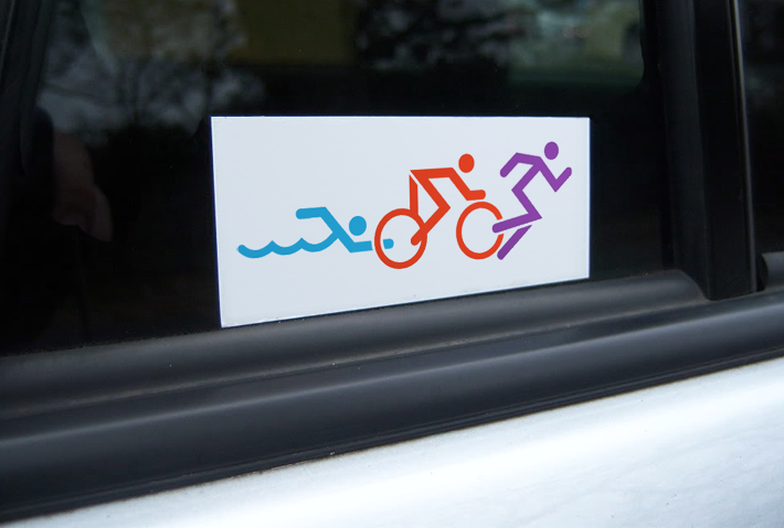
Car stickers!