Comconn Brand & Design
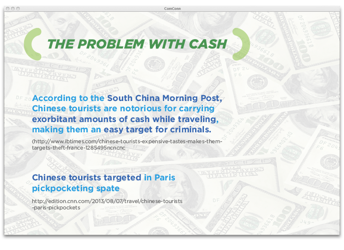
ComConn is a China UnionPay e-commerce acquirer and payment processor which specializes in cross-border payment for worldwide merchants to sell to China and Chinese users online, through mobile and POS. They essentially aid with the safe use of money for overseas travelers who are making purchases internationally.
Business Cards
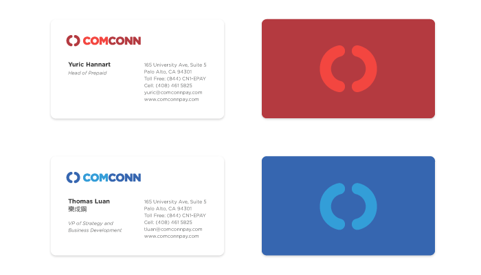
The parentheses became an early contender in the brand design process. It represents succinctly the idea of a container or protective shield, while also being a typographic marker for an explanation or clarifying aid. It also represents CC from the name ComConn, which is an abbreviation of “Commerce Connected”.
Comconn Website
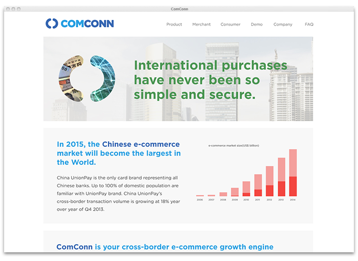
The parentheses are the key graphical component and can be applied in a variety of ways, including: a framing element for text, an image container, or simply a standalone graphic for texture. With the addition a vibrant colour palette, the brand translated nicely to a host of marketing materials and online tools.
Brand Palette

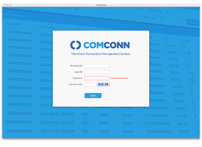
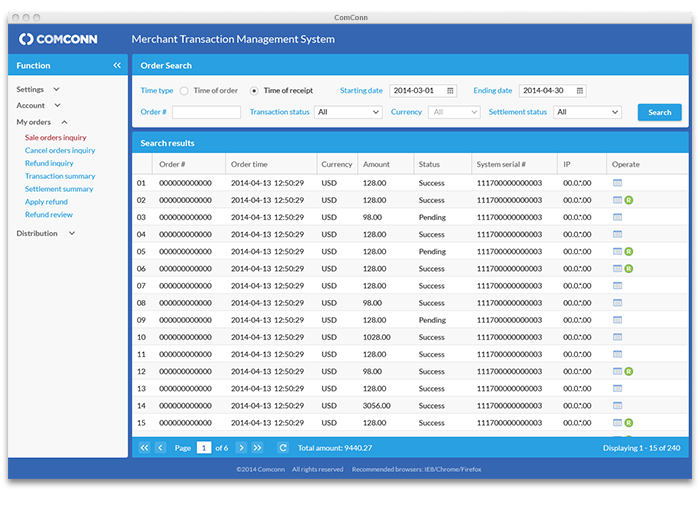
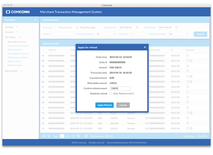
TMS Client UI Refresh
Presentations to Clients